 The problem:
Our home website needs to reach late adopter users of our software, whom we target. (They are not on Facebook or Twitter and often enter URL's into the Google search bar). The site also needs to reach technically proficient graphical designers and user experience designers. And, to make things even more difficult, we also need to reach an open source community of developers. Each of these knowledge domains has a unique language jargon used within the domain, and cannot be mixed with others... A content strategists nightmare.
The solution:
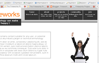
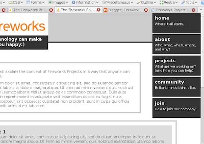
Available in Concept A and B are content switching tabs on the left side of the relevant content area which you can see in this screen shot on the left. JavaScript code smoothly transitions the content from one knowledge domain language to another.
Pitfalls:
Accessibility issues will have to be worked out for users that have to use screen readers or are unable to use a mouse.
Awesomeness:
We don't need to have different websites, which creates brand confusion, and we don't have to have different URL's for different content types.
2. Our second sticky bit is the layout of the navigational elements.
The problem:
As a company focused on user experience, we want more than 1 word hints on our navigation buttons indicating where they will take you and what you will find when you get there. This means our buttons are going to be larger than normal to fit the extra text.
The Solution:
Well, we don't have a good solution yet... So, a little help would be appreciated. Concept A lays them out horizontally, while concept B lays them out vertically. Personally I like the look of horizontal navigation, but in our case the typeface within them would need to be quite small to fit 5 large buttons across the top of the screen along side a logo header. While the vertical buttons in concept B provides plenty of space for large text, they complicate the layout of the rest of the page by hanging down so far.
The problem:
Our home website needs to reach late adopter users of our software, whom we target. (They are not on Facebook or Twitter and often enter URL's into the Google search bar). The site also needs to reach technically proficient graphical designers and user experience designers. And, to make things even more difficult, we also need to reach an open source community of developers. Each of these knowledge domains has a unique language jargon used within the domain, and cannot be mixed with others... A content strategists nightmare.
The solution:
Available in Concept A and B are content switching tabs on the left side of the relevant content area which you can see in this screen shot on the left. JavaScript code smoothly transitions the content from one knowledge domain language to another.
Pitfalls:
Accessibility issues will have to be worked out for users that have to use screen readers or are unable to use a mouse.
Awesomeness:
We don't need to have different websites, which creates brand confusion, and we don't have to have different URL's for different content types.
2. Our second sticky bit is the layout of the navigational elements.
The problem:
As a company focused on user experience, we want more than 1 word hints on our navigation buttons indicating where they will take you and what you will find when you get there. This means our buttons are going to be larger than normal to fit the extra text.
The Solution:
Well, we don't have a good solution yet... So, a little help would be appreciated. Concept A lays them out horizontally, while concept B lays them out vertically. Personally I like the look of horizontal navigation, but in our case the typeface within them would need to be quite small to fit 5 large buttons across the top of the screen along side a logo header. While the vertical buttons in concept B provides plenty of space for large text, they complicate the layout of the rest of the page by hanging down so far.


So, help us out and lend your expertise in the comments here. And while you're at it, if you are not already a member of the Fireworks Project, then check it out.

I don't know if we necessarily need more than one word navigational hot buttons. I really thing that should be something we test. It very well could turn out that most people recieve exactly what they expect with the one word button.
ReplyDeleteOr not.
Anyway, I'm with you. I like the horizontal.