- The processor.
- The memory.
- The storage.

Tuesday, August 25, 2009
Start Programming Quick and Dirty
Warning: This really is a quick and dirty start to computer programming, and if you know anything about software development, I'm sure you will find plenty of defects in my crude descriptions of computing. The point here is to communicate the basic understanding to begin learning without submarining a person's brain with useless detail. If a beginning programmer learns the quick and dirty way, then as their knowledge and interest grows, they can go back and fill in all the little details later.
When you are writing computer code, or even just using a computer, it really helps if you keep in mind the three things that make up all computing devices.
Monday, June 15, 2009
The Fireworks Project Logo is Done
Tuesday, June 9, 2009
The Fireworks Project Website Design
At the Fireworks Project, we are in the midst of designing our home page. We are an open, member managed company, so we are working with a team from around the globe without any face to face collaboration time. There are some challenges, but it is going to be interesting to see what comes out of it, and a big sense of satisfaction in having done it.
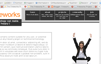
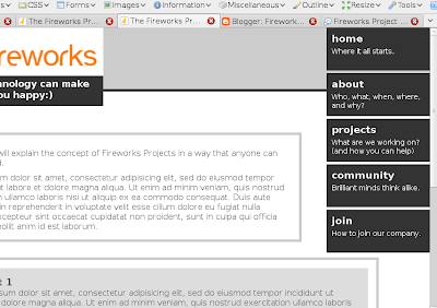
So at the time of this post we are in the layout and navigational wire frame phase. We have some constraints, and a couple of wire frames that we are currently working on. Remember, that this phase of the design process is focused on layout and navigational elements, so although suggestions for colours, logo, and other graphical elements is welcome, what we really need to hear is your thoughts on the layout. So let's get down to business and get some critique.
Concept A is available here.
Concept B is available here.
1. The first bit we need some comments on is the content switching mechanism we are using.
 The problem:
Our home website needs to reach late adopter users of our software, whom we target. (They are not on Facebook or Twitter and often enter URL's into the Google search bar). The site also needs to reach technically proficient graphical designers and user experience designers. And, to make things even more difficult, we also need to reach an open source community of developers. Each of these knowledge domains has a unique language jargon used within the domain, and cannot be mixed with others... A content strategists nightmare.
The solution:
Available in Concept A and B are content switching tabs on the left side of the relevant content area which you can see in this screen shot on the left. JavaScript code smoothly transitions the content from one knowledge domain language to another.
Pitfalls:
Accessibility issues will have to be worked out for users that have to use screen readers or are unable to use a mouse.
Awesomeness:
We don't need to have different websites, which creates brand confusion, and we don't have to have different URL's for different content types.
2. Our second sticky bit is the layout of the navigational elements.
The problem:
As a company focused on user experience, we want more than 1 word hints on our navigation buttons indicating where they will take you and what you will find when you get there. This means our buttons are going to be larger than normal to fit the extra text.
The Solution:
Well, we don't have a good solution yet... So, a little help would be appreciated. Concept A lays them out horizontally, while concept B lays them out vertically. Personally I like the look of horizontal navigation, but in our case the typeface within them would need to be quite small to fit 5 large buttons across the top of the screen along side a logo header. While the vertical buttons in concept B provides plenty of space for large text, they complicate the layout of the rest of the page by hanging down so far.
The problem:
Our home website needs to reach late adopter users of our software, whom we target. (They are not on Facebook or Twitter and often enter URL's into the Google search bar). The site also needs to reach technically proficient graphical designers and user experience designers. And, to make things even more difficult, we also need to reach an open source community of developers. Each of these knowledge domains has a unique language jargon used within the domain, and cannot be mixed with others... A content strategists nightmare.
The solution:
Available in Concept A and B are content switching tabs on the left side of the relevant content area which you can see in this screen shot on the left. JavaScript code smoothly transitions the content from one knowledge domain language to another.
Pitfalls:
Accessibility issues will have to be worked out for users that have to use screen readers or are unable to use a mouse.
Awesomeness:
We don't need to have different websites, which creates brand confusion, and we don't have to have different URL's for different content types.
2. Our second sticky bit is the layout of the navigational elements.
The problem:
As a company focused on user experience, we want more than 1 word hints on our navigation buttons indicating where they will take you and what you will find when you get there. This means our buttons are going to be larger than normal to fit the extra text.
The Solution:
Well, we don't have a good solution yet... So, a little help would be appreciated. Concept A lays them out horizontally, while concept B lays them out vertically. Personally I like the look of horizontal navigation, but in our case the typeface within them would need to be quite small to fit 5 large buttons across the top of the screen along side a logo header. While the vertical buttons in concept B provides plenty of space for large text, they complicate the layout of the rest of the page by hanging down so far.


So, help us out and lend your expertise in the comments here. And while you're at it, if you are not already a member of the Fireworks Project, then check it out.
Subscribe to:
Posts (Atom)